Coffeedesk: product discovery and a design system for a coffee marketplace
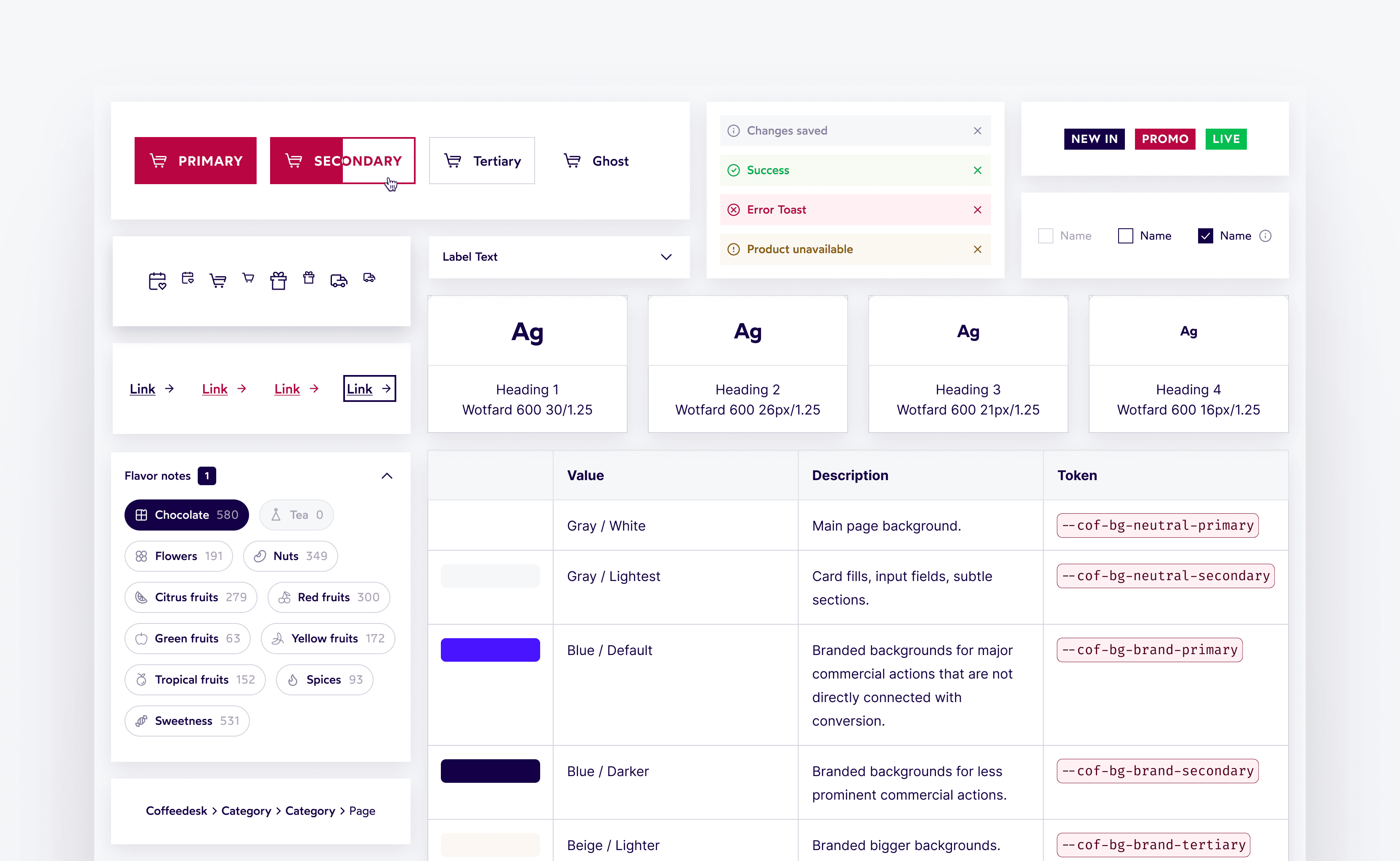
Coffeedesk sells one of the largest coffee selections in Europe, online and in its own cafés. As the only designer, I work across the whole e-commerce platform. Two pieces of that work: a redesigned product listing tested with four customer segments, and a design system that gives a Shopware store its first guardrails.
Type
E-commerce
, Design System
Role: Product Designer, sole designer
Timeline: 2026 – now
Company: Coffeedesk
1. Product listing
Context
Coffeedesk has one of the largest coffee selections in Poland and the rest of Europe, but product discovery was a known pain point - the catalog is extensive and filters were hard to use. To understand the real scope of the problem, I ran usability sessions across 4 user segments: from casual buyers to professional baristas.
What I found
The biggest blockers: sorting was hard to find, filters were poorly labeled and grouped, the product list had no visual scanning mode, and less experienced users were lost by technical filter categories they didn't understand. At the same time, visual elements (icons for brewing methods and flavor notes) worked well across all segments.
What I designed
Based on the findings, I redesigned the product listing page: restructured filters into a single scrollable panel (accordion groups on desktop and chip groups on mobile), separated sorting and made it immediately accessible, introduced visual filter chips for methods and flavor notes, and moved to a full-width layout. I validated the direction with a second round of testing before finalizing the concept.
Where we are now
The first iteration, covering the new filter and sorting mechanics, is live. I'm now tracking how customers use the new filters and how that affects add-to-cart conversion. Results will follow here.
2. Design system
Context
Coffeedesk's online store runs on Shopware, where content and layouts are managed directly by admins. Without defined rules or component standards, each admin builds UI elements however they see fit. The intentions are good, but the lack of guardrails leads to broken patterns, inconsistent interactions, and growing design debt - the same problems solved differently across different parts of the store.
What I'm doing and why
Before rethinking the visual identity, the store needs a solid foundation. The first stage of this project is building a design system that documents how every component should look and behave - creating a shared language between design and Shopware admins. This means closing existing gaps (missing states, inconsistent logic, accessibility issues) and making only the changes that are strictly necessary from a usability or accessibility standpoint. Visual and branding updates come later, in stage two, once the system is live and in use.
Where we are now
The documentation is nearly complete. In Q3 2026 we began implementation: rebuilding the store with the new components and extending the system into the Shopware admin panel. The foundations and core components (buttons, links, tags) are built and already used in newly designed elements. Migrating the existing pages is the next stage.